Wayfinding System
Typography / Layout / Signage
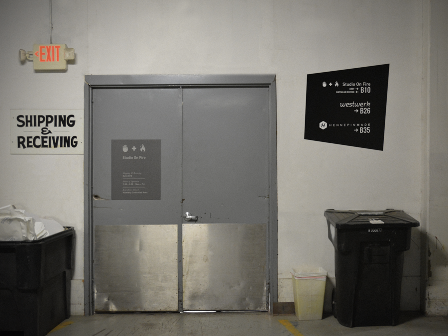
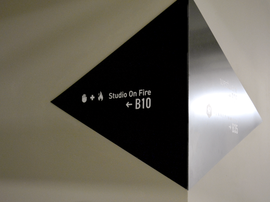
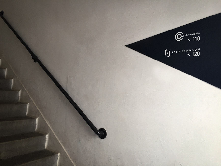
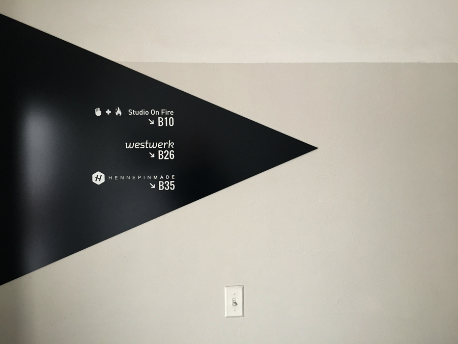
While working with the great guys at Westwerk, I was tasked with creating a wayfinding system for their building. The end goal is always to get a visitor to where they need to go, but this being a creative building I wanted to push the boundaries a bit.
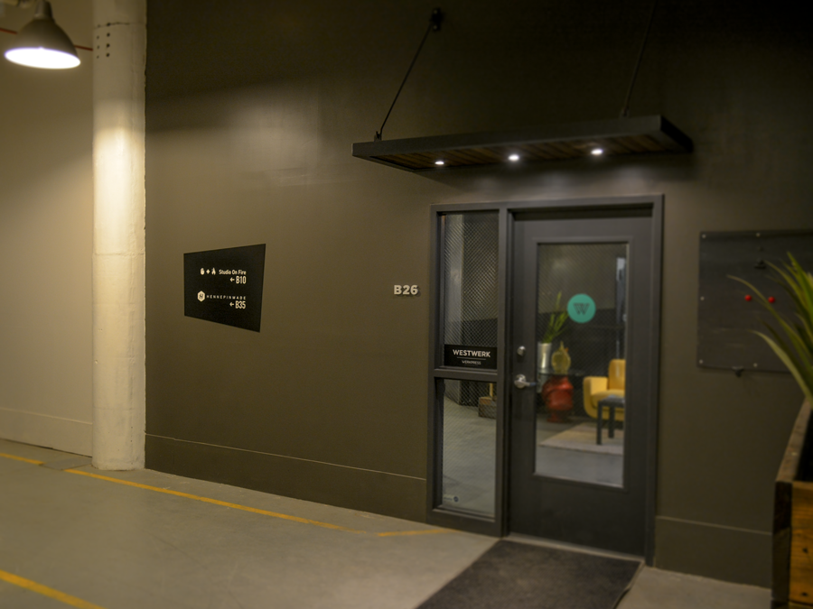
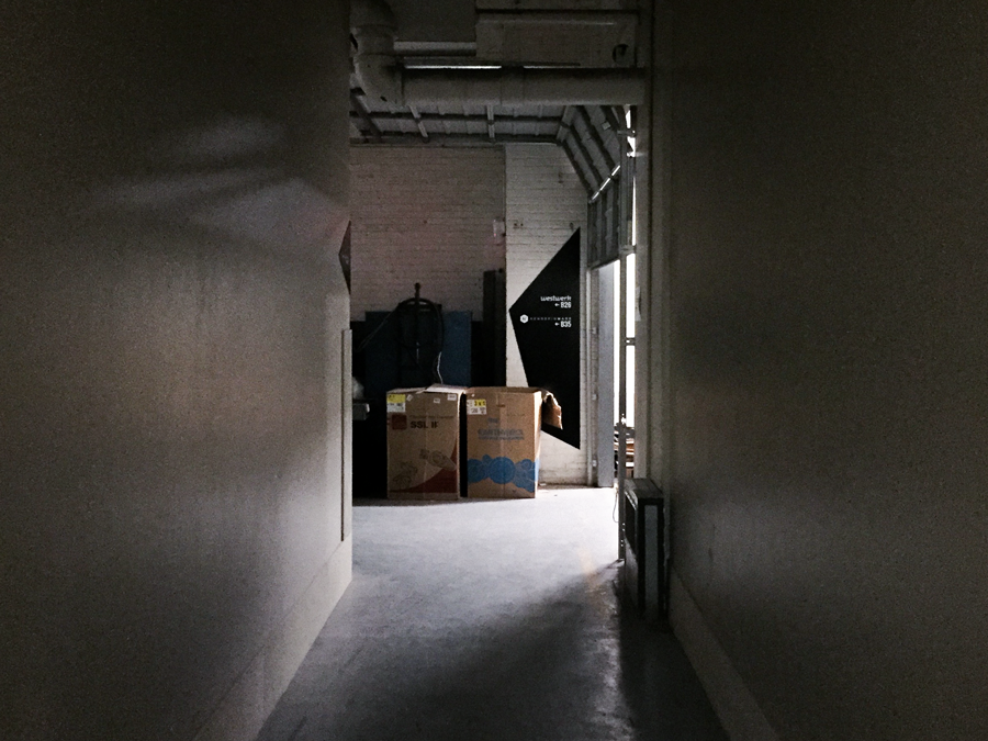
The building is an old industrial warehouse and has some pretty unique spaces. The creative companies that are renting in the building have interpreted their spaces in many unique ways. I wanted the signage to be eye catching and useful, yet also neutral to fit the space. There are many different back drops in the building so I refined to get this design.
You become well aware of where you are and where you are trying to go while entering new spaces. This project taught me user experience design that I wasn't necessarily thinking I would pick up on. Creating mock ups of the space and imposing my ideas on top was a great way to present my design and sell my ideas for the system.

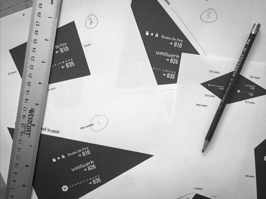
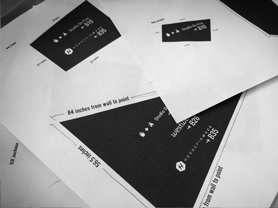
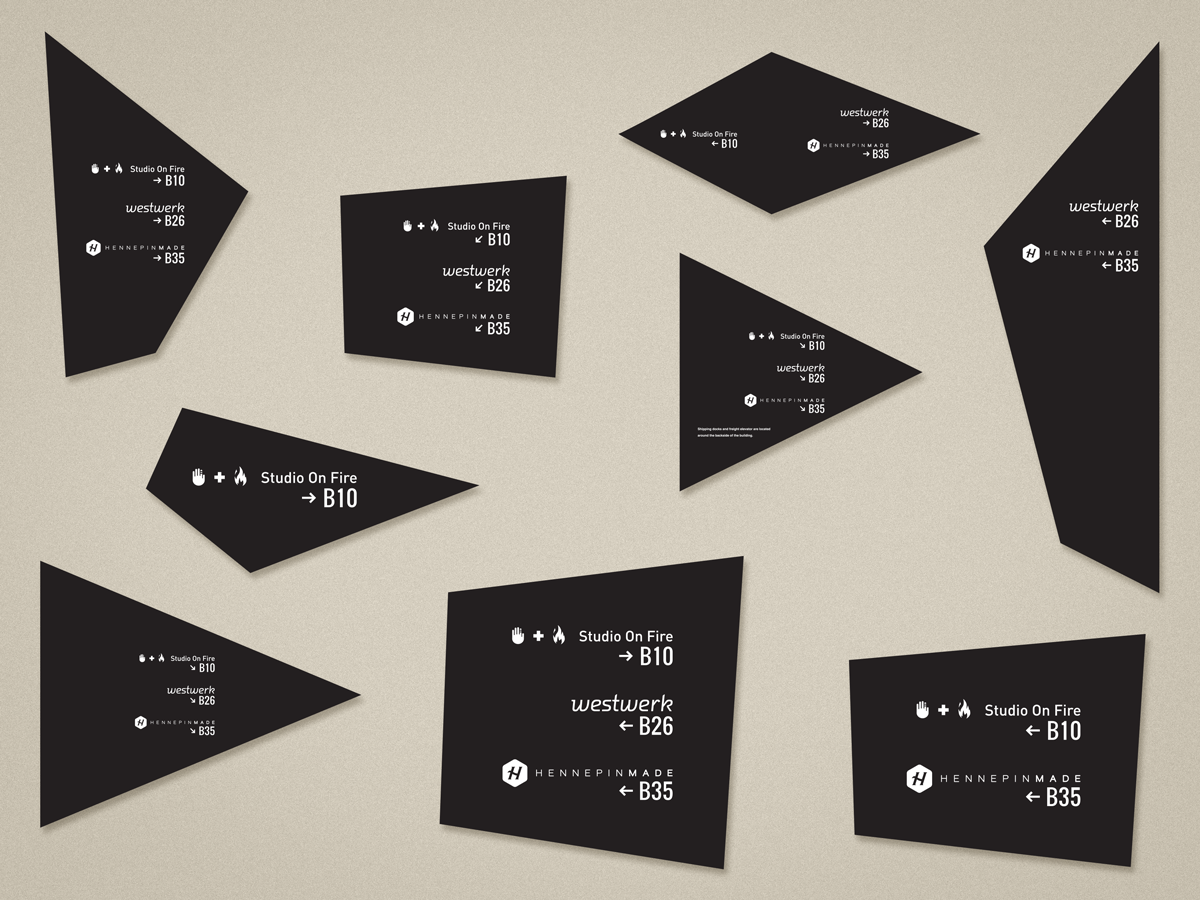
PROCESS
Typography / Layout / Signage
To help create consistency, I created a grid system to layout the logos and typography. I used geometric forms that mocked the direction the user is to travel create an engaging visual. These shapes act as a small family of cohesive navigation signs as you travel through out the building.